How Jurors Judge Watercolour Competitions: A Practical Guide for Artists
If you’ve ever entered a watercolour (or wider art) competition and wondered, “What are they actually looking for?”you’re not alone. I’ve been on both sides – submitting work and serving as a juror for multiple in-person and online competitions, both nationally and internationally.
This is my comprehensive guide to how judging often works, what criteria may be used, and how to present your work well – especially for online submissions. I’ll also be honest about something artists don’t always hear: every judge has biases. The goal isn’t to pretend we don’t – it’s to know them, name them, and judge with integrity.
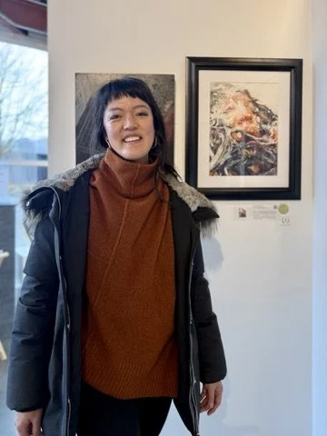
With my painting serving as a live juror at the Federation Gallery
1) Start here: some competitions have prescribed criteria
Many organisations provide jurors with a written rubric. If they do, it matters – because jurors are often expected to follow it closely, especially in established societies and juried exhibitions.
If the competition publishes criteria, read it carefully and treat it like a brief. Even if you don’t agree with every point, it’s the framework you’re being assessed within.
Here are common criteria you’ll see (wording varies, but the ideas are consistent):
A) Design and composition (how the painting reads)
Jurors often start with the big read. Does the piece have a clear structure? Is there a sense of intention in how shapes are arranged, where the eye travels, and where it rests? A strong painting usually has:
A clear focal area (even if it’s subtle)
A sense of balance and visual hierarchy
Shapes and edges that feel designed rather than accidental
Enough clarity at thumbnail size to hold attention
B) Draftsmanship and accuracy (when the work is representational)
If you’re painting something recognisable – a portrait, a figure, an animal, architecture – jurors will often look for structural believability. That doesn’t mean you can’t stylise. It means the stylisation still needs to feel intentional, not like the drawing fell apart.
C) Value, light, and depth
Values are one of the quickest indicators of skill because they’re doing so much heavy lifting: light, form, mood, and readability. Jurors may ask:
Does the light make sense?
Is there a strong value pattern (not just “lots of mid-tones”)?
Are the darks purposeful, and do they support the focal point?
D) Colour and temperature control
Colour is often judged less by “prettiness” and more by control and relationships. Many jurors are looking for evidence that you understand:
Warm vs cool balance
Saturation vs neutral passages
Colour harmony (even in a limited palette)
Whether colour choices strengthen the emotional intent of the piece
E) Handling of the medium (watercolour-specific skill)
Because watercolour is unforgiving, jurors often pay attention to whether the artist is working with the medium rather than fighting it. Depending on the organisation, that can include:
Confident washes and transitions
Clean layering (or intentional wet-into-wet softness)
Edge control (lost-and-found, hard vs soft)
Avoiding overworking and muddiness
Preserving whites and transparency (when that’s part of the brief)
Some organisations also have preferences around what “counts” as watercolour (for example, limits on opaque media, heavy mixed media, collage, or digital alteration). Always check the prospectus.
F) Impact, presence, and “does it hold you?”
This is the part that’s harder to quantify, but it’s real. Jurors may be asking:
Does it stop me?
Does it stay interesting after the first glance?
Is there a sense of atmosphere, tension, tenderness, story, or mystery?
G) Originality and voice
Many organisations explicitly reward work that feels personal rather than derivative. That doesn’t mean you have to reinvent the wheel – but jurors often respond to paintings that show:
A point of view
A willingness to take risks
A sense of the artist’s own visual language
H) Professionalism and eligibility (often overlooked, but common in organisations)
This is the unglamorous side, but it’s very real in juried shows:
Does the work meet the size, medium, and date requirements?
Is it properly titled and labelled?
If it’s an in-person show, is it presented according to framing/mounting rules?
If it’s online, is the image file correctly prepared?
Sometimes a strong painting is disqualified or marked down simply because it doesn’t follow the submission rules.
I) Cohesion with the exhibition (panel-dependent)
Some juries consider how a piece sits within the overall show. They may ask whether the work contributes variety, quality, and balance to the final selection.
That can be frustrating as an entrant, but it’s common – especially in society shows where the goal is a strong exhibition as a whole, not just a list of individual favourites.
2) Not every competition has a rubric – and that’s where “judge bias” comes in
Some competitions don’t provide any written criteria at all. In those cases, jurors are often left to their own internal framework.
That can feel unfair as an entrant, but it’s also reality – and it’s why it’s helpful to understand that judging is a mix of:
Objective assessment (design, values, drawing, control of medium)
Subjective response (taste, preference, lived experience, worldview)
Every judge has biases. The best judges I know aren’t the ones who claim to be neutral – they’re the ones who understand their own leanings and try to judge thoughtfully within them.
3) My own criteria (and biases), stated plainly
I can’t speak for every juror, but I can be transparent about my own.
Excellence
For me, excellence points to technical mastery and strong design. It includes things like:
Clear value structure
Intentional edges and shapes
Confident handling of watercolour
Compositional clarity
Beauty
Beauty, for me, is partly about whether something is aesthetically pleasing – and I realise that can be subjective. I also try to give space for style. Obviously a painting doesn’t have to look like my work or my ideal in order to be excellent.
Truth and goodness
This is a personal bias I acknowledge. I often find myself asking, “Is it good and true?”
That doesn’t mean I only value one subject matter or one style. But it does mean this: even if a work is technically excellent, if it presents something I believe is a lie as truth, or an evil as good, I may favour another piece over it.
I also want to be clear that there are some things I may mark down heavily, or even disqualify, depending on the organisation’s rules and the context. If I see something as vulgar, crude, or simply in poor taste, I’m unlikely to reward it. And if a piece depicts violence against recognisable individuals, I’ll definitely disqualify it.
I’m sharing that not to moralise, but to be honest about how a juror’s worldview can shape their decisions – and why it matters for judges to know what they bring into the room.
Message and subtlety (why “overly literal” can get marked down)
This is another personal preference that shows up in my judging. Regardless of whether I agree with the message of a piece, I’m less likely to choose it if the message is overly literal.
I can often overlook another artist’s ideology if the work is beautiful and technically excellent. But if the painting is literal over poetic – I will likely choose something else over it.
The biggest criterion for me: emotional pull
If I had to name the single biggest factor, it’s this: does the piece reach my heart?
Some paintings can be beautiful and technically excellent, and yet feel strangely void of soul. They’re “correct” – but they don’t move you.
On the other hand, I’ve seen work that isn’t perfect technically, but it carries honesty, vulnerability, presence – something human. And I will often choose that.
Example: a portrait with slightly awkward drawing in one area, but the expression is alive and the values are doing something true – that may stay with me longer than a flawlessly rendered piece that feels emotionally flat.
Example: a watercolour with bold, imperfect passages where the artist took a risk – and the risk created impact – may stand out more than a cautious, polished painting that never really commits.
Another personal memory I have is choosing a portrait of a cat over all the other more exotic animal paintings I saw in a set. While I realise the technical mastery in other pieces and the effort they sought in acquiring their own reference photos themselves, the emotional relatability and fuzzy emotions evoked in me feeling of it truly stretching in its peaceful nap.
4) How online judging typically works (and why it can feel ruthless)
Many competitions now have an initial online submission round. Jurors may be viewing dozens to hundreds of entries.
In that first pass, decisions often happen fast – not because jurors don’t care, but because the volume requires it.
The “cull” (a gracious word for a hard job)
When I’m judging a large batch, I may go through the full set and start removing works that aren’t accepted.
I want to be careful with language here: a work that doesn’t get accepted isn’t necessarily a bad painting. It may simply be a “no award” in that context – for that show, that year, that juror panel.
Still, when there are so many submissions, judging has to be both objective and, at times, ruthless – because the process demands decisive sorting.
Thumbnail reality: composition gets judged quickly
Because entries are often viewed as thumbnails, one of the fastest eliminators is poor composition.
If the design doesn’t read at a small size, the piece can be cut early – even if it would feel more impressive in person.
5) Digital presentation can make or break your entry
This part surprises artists, but it shouldn’t: in online competitions, jurors are judging what they can see. And what they can see is only as good as your photo.
I’ve seen strong work undermined by poor digital presentation, including:
Photos taken in portrait mode where the face is in focus and the rest of the painting is blurry
Tungsten lighting with no white balance correction (everything goes yellow/orange)
Images not cropped – sometimes showing the desk, a coffee mug, tape, clutter, or background distractions
A whole framed piece photographed in a dim studio (glare, reflections, dark corners)
A photo that includes a mat (mats can distort perceived values and colour)
Buckled paper exaggerated by side lighting, making the surface look uneven
Here’s the hard truth: whatever you submit will often be displayed exactly as-is.
And jurors have reputations too. A judge’s name is attached to the winners. Most jurors won’t want to endorse a poor reproduction of your work – not because they’re snobbish, but because they care about the medium and want the winning work to represent it well.
Simple photo standards I recommend
Photograph in bright, even light (daylight is best)
Keep the camera parallel to the artwork (no keystone distortion)
Turn off portrait mode
Crop to the artwork only (no frame, no mat)
Correct white balance so whites look white
Ensure the whole painting is sharp
Another easy way is to scan your work on a photo scanner. If you work exceeds the size of your scanner, it is very straight forward to stitch the work together using the automated workflows that come with Adobe Photoshop. This is my personal preferred method for my own work. The downside is that a scanner can remove any texture of your watercolour paper.
6) The in-person round: what changes when jurors see the work live
If there’s a final round in person, a few things shift.
Scale and presence matter more – some paintings have a quiet power that doesn’t translate online.
Edges, washes, and surface quality become clearer.
Paper handling becomes obvious (mud, overworking, chalky passages, or confident transparency).
Sometimes a piece that was “fine” online becomes stunning in person. Sometimes the reverse happens.
7) Other factors that can influence outcomes (for better or worse)
A few more realities worth knowing:
Cohesion with the show: Some jurors consider whether a piece fits the overall standard or tone of the exhibition.
Originality vs familiarity: Work that feels derivative may be scored lower even if it’s competent.
Risk-taking: Some panels reward boldness; others reward refinement. It depends on the jurors and the organisation.
Consistency: In multi-image submissions, one weak image can pull down a strong set.
8) A final encouragement (especially if you’ve been rejected)
Rejection stings – and I don’t think artists should pretend it doesn’t; I have had work rejected in one show and have the same painting win others. But a “no” from a competition is not a final verdict on your work or your calling.
If you want to grow through the process, here are two questions that can help:
Was my painting strong in design, values, and medium handling – even at thumbnail size?
Did my digital presentation honour the work well enough for a juror to judge it fairly?
And if you’re entering competitions regularly, it’s worth remembering: the panel changes, the criteria changes, and the outcomes change. Keep making work that is excellent, honest, and alive.
The key thing to remember is to not make work for competitions. It is better to paint something for the joy of painting, to say what you need to say, and for the emotional connection you have to the subject. This is when we produce out most authentic and best work.