
How to Choose a Photo for a Watercolour Portrait Commission
Choosing the right reference photo is the single biggest factor in how your watercolour portrait turns out. Not because I need a “perfect” photo, but because watercolour is honest – it translates light, shape, and atmosphere in a very direct way. A strong photo gives us something solid to build on, so the finished portrait can feel both true to the person and true to the medium.
If you’re commissioning a portrait (for a child, a partner, a memorial, or a gift), here’s what to look for.
Start with the feeling, not the pixels
Before we get technical, ask yourself one question: What do you want this portrait to feel like?
Do you want tenderness? Strength? Joy? Quietness? A sense of closeness? The best reference photos carry a clear emotional centre. That matters more than having the newest phone camera.
1) Choose natural light whenever possible
Soft natural light is your best friend.
Look for:
Window light (standing near a window, not directly under a ceiling light)
Open shade outdoors (like under a porch or beside a building)
Golden hour if you want warmth and glow
Try to avoid:
Harsh midday sun (strong shadows under eyes and nose)
Mixed lighting (a yellow lamp plus blue daylight – it makes skin tones confusing)
Flash (it flattens the face and can distort colour)
2) Prioritise sharp focus on the eyes
If the eyes are soft or blurry, the whole portrait can feel slightly “off,” even if everything else is fine.
Zoom in on your photo and check:
Are the eyes in focus?
Can you see the shape of the eyelids clearly?
Is there some catchlight (a little reflection) that makes the eyes feel alive?
A portrait doesn’t need hyper-detail everywhere, but the eyes need clarity.
3) Pick an angle that feels like them
A straight-on photo can work, but it’s not automatically the best.
Often the most natural portraits come from:
A slight turn of the head (more depth, more life)
A candid moment where the expression is real
A viewpoint that feels like how you remember them
If you’re commissioning a memorial portrait, this matters even more. The “right” photo is usually the one that makes you quietly say, yes – that’s them.
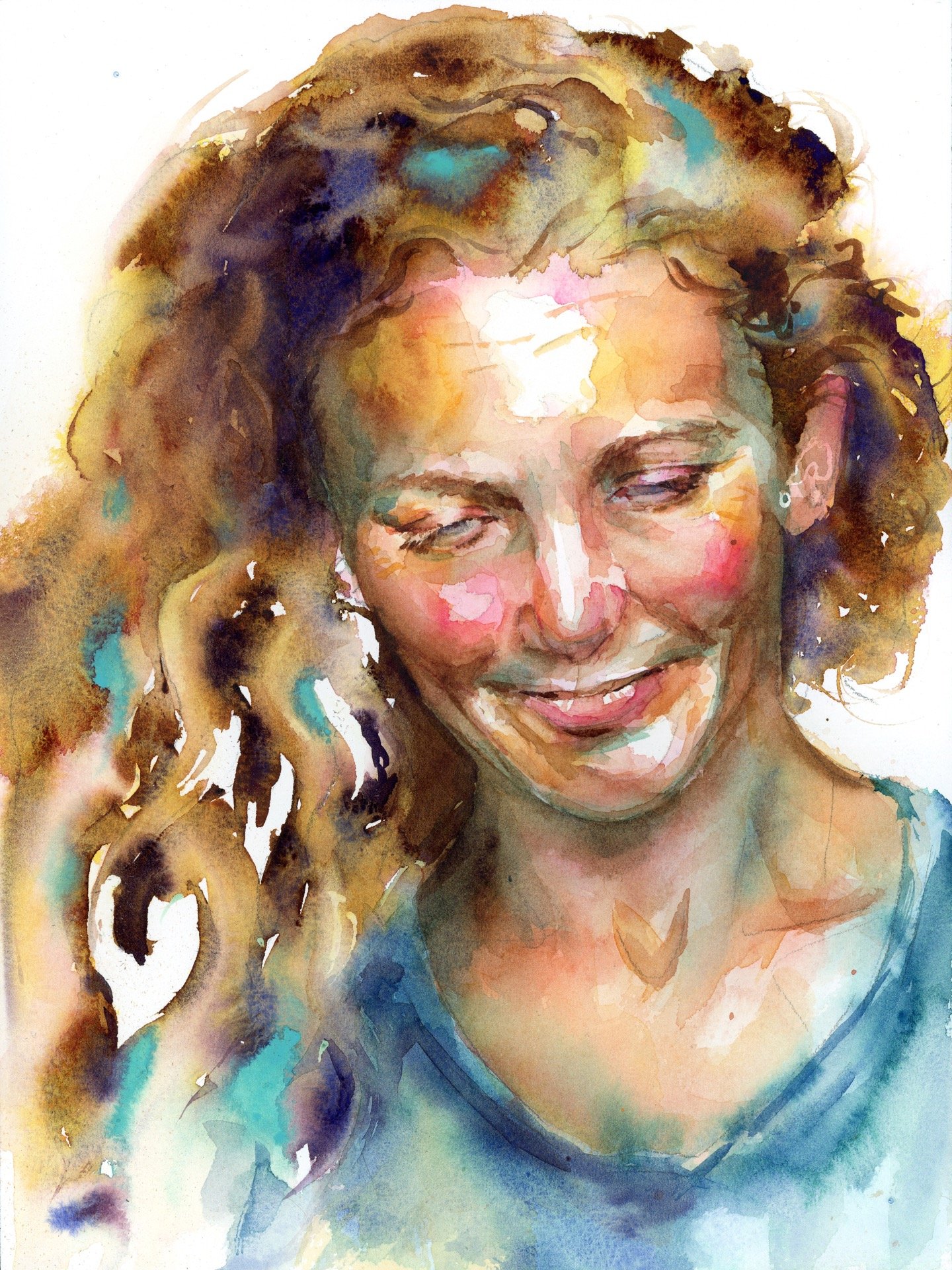
4) Avoid heavy filters and beauty edits
I know it’s tempting to choose the most polished photo, but filters can:
Change skin tone dramatically
Blur important facial structure
Add artificial contrast that doesn’t translate well
If you can, choose an unfiltered image. If the only photo you love has a filter, send it anyway – but also send a couple of unedited options so I can compare.
5) Make sure the features aren’t distorted
Phone cameras can distort faces, especially if the photo was taken very close.
Try to avoid:
Wide-angle selfies (they can enlarge the nose and shrink the ears)
Photos taken from below (it changes jawline and proportions)
Better options:
A photo taken from a little distance away
A portrait-mode photo (if your phone has it)
A photo taken at eye level
6) Expression matters more than a “smile”
Some people light up when they smile. Others look most like themselves when they’re calm.
Choose the expression that feels honest.
If you’re unsure, send a few options:
One with a natural smile
One neutral
One that shows their personality (a laugh, a thoughtful look, a familiar glance)
We can decide together what will translate best.
7) Hair and clothing: simple reads best
Watercolour loves simplicity.
Clothing with:
Clear shapes
Minimal busy patterns
Good contrast against the background
…tends to translate beautifully.
If the clothing is patterned or very detailed, it can still work, but it may pull attention away from the face. If you want the portrait to feel timeless, simpler is usually stronger.
8) Background: clean is helpful, but not required
A plain background is easiest, but you don’t need a studio photo.
If the background is messy or distracting, I can often simplify it in the portrait. What I need most is a clear read of the face and lighting.
If there’s something meaningful you want included (a favourite chair, a garden, a landscape), mention it. Sometimes a hint is more powerful than a full scene.
9) If you only have one photo, send it (plus context)
Sometimes you’re commissioning a portrait from a single image – especially for memorials or older family photos. That’s okay.
If you only have one option, it helps to also share:
A few words about their personality
What you want the portrait to communicate
Any notes about colouring (for example, “his hair was more auburn than this photo shows”)
Watercolour is interpretive, but it can still be deeply accurate in presence.
What to send me (simple checklist)
If you can, send:
3–8 photos (even if you have a favourite)
At least one image with clear eyes and natural light
Notes on what you love about them (and what you want the portrait to feel like)
Any non-negotiables (keep freckles, include a specific necklace, etc.)
A quick word on expectations
A watercolour portrait isn’t about copying a photo pixel-for-pixel. It’s about translating a real person through light, shape, and story.
When the reference photo is strong, the portrait has room to be both beautiful and honest – and that’s where watercolour shines.
Want help choosing your photo?
If you’re planning a commission and you’re torn between a few images, send them over. I can tell you which one will translate best in watercolour, and why.